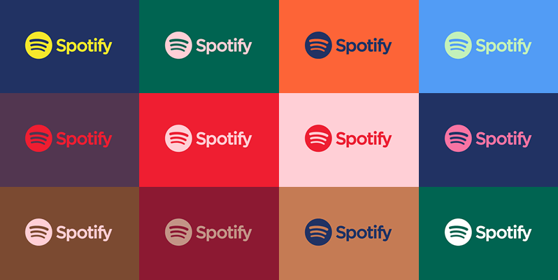
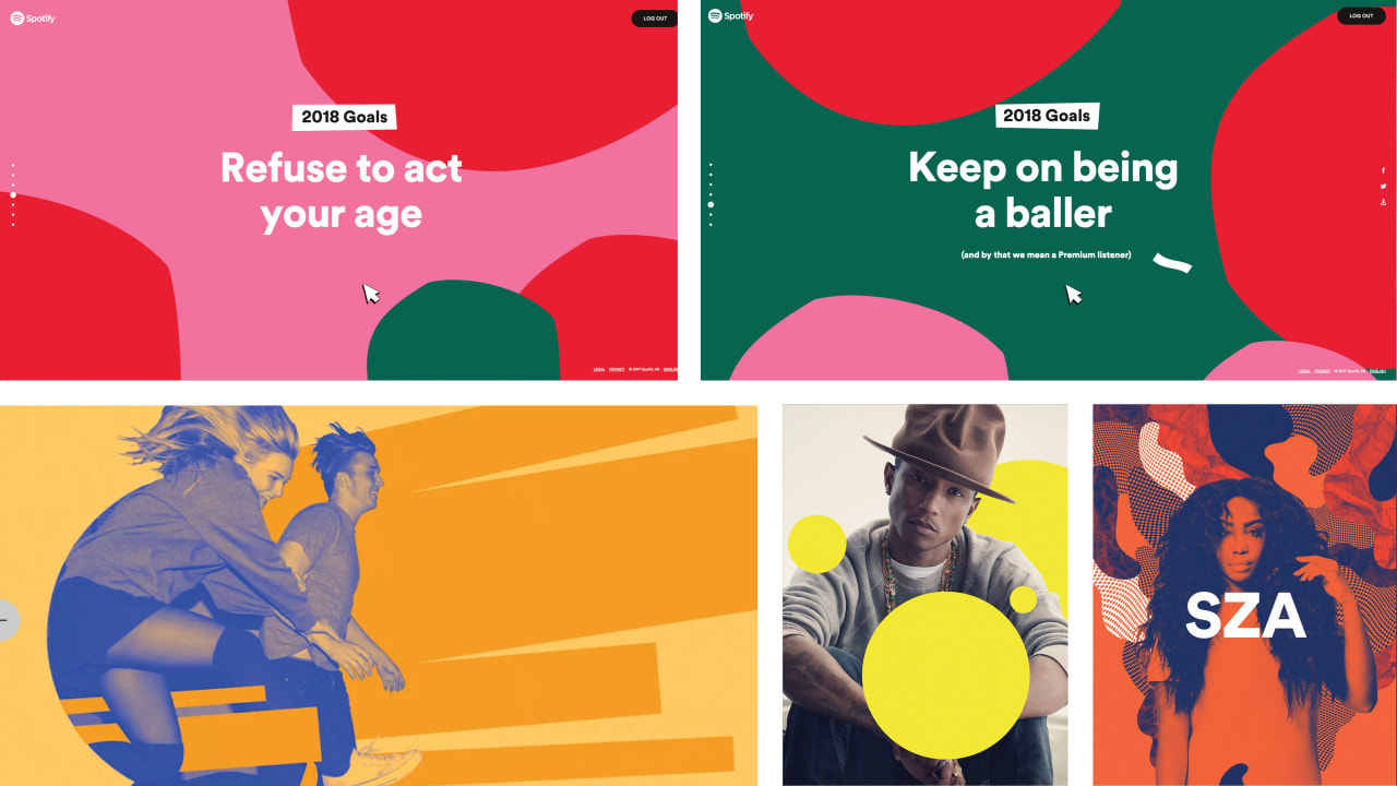
 Until recently I had it drilled into my brain that a brand always followed a strict set of guidelines, especially when it came to using a color pallet. But with today's competition, the effort to be heard over all the buzz online and in stores has pushed designers to find bolder ways to getting brands to stand out from everything. More and more companies are integrating multiple brand color schemes, and finding major success in response. Example #1: SpotifySpotify started adopting this change in branding a few years ago across all marketing efforts and brand standards. They found their inspiration from diving into music history. In fact, designs from album covers from the 60's influenced the duotone graphics they are so well known for today.
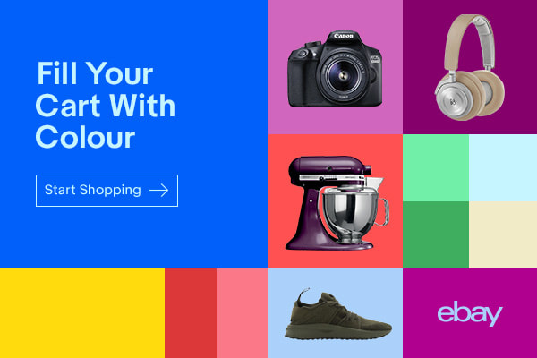
Example #2: EbayEbay partnered with Form& to define a new language for experiences. They released the logo from it's four color treatment, designing a system where the logo could become a symbol of how diverse ebay is.
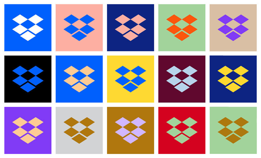
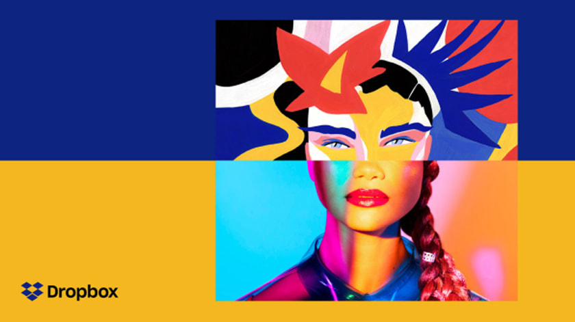
Example #3: DropboxDropbox was directly inspired by Andy Warhol. They have created what feels like an endless amount of color combinations with loud unique artwork. Their goal was to create a system that would allow them to experiment over time and not operate like brand police.
Spotify does a nice job of balancing color palettes when applying this trend. They don't complicate it with endless color combinations and use this simplicity to allow their messaging to take the spotlight. I think Ebay has the best execution with this trend. Their guidelines supply a grid system and mood color palette options for a more modern twist. Dropbox seems very random and loud. They complicate their guidelines and leave things open for evolution of the brand which can lead to confusion for users.
One thing all three companies do well with this trend is that they have created a diverse brand that has allowed their logos to become symbols, all while standing out in a vast sea of marketing efforts on digital platforms and more.
0 Comments
 People who are considered artistic tend to be attracted to activities that involve creativity, originality, and independence (ways to express their uniqueness). All great designers have a natural artistic talent and is skilled in a variety of art techniques. Personally, I feel there are 3 essential qualities to look for in a graphic designer: 1. Passion & DriveMost designers are in a creative industry because they want to do what they love. Naturally, work entails odd hours, endless edits, and bizarre briefs. You want to look for a designer who taps into this passion to keep going and has learned to balance projects and master time management. 2. Ability to CommunicateA skilled designer has excellent communication skills. They are good listeners and are able to gather what a client is expecting. Communication is imperative to present, charm and negotiate. You definitely want to look for a designer who can remain professional in sticky situations and be clear with a client. 3. OpennessIn any creative field a designer needs to be open-minded, receptive to change and new ideas. You want to look for a designer who is comfortable in taking advice from unexpected sources, even if it is criticism. They should be good at taking direction to improve their work, be open to finding new sources of inspiration, and have the drive to never stop learning. I have found that a lot of companies now ask applicants to take personality questionnaires. These self-report questionnaires don't always give a clear insight to how a person perceives the world around them and makes decisions. My advice is to make a list of what qualities you want in a designer before you start to interview.
|

Marissa MayerI am a graphic designer with a love for clean lines, creative details, and visual balance. My goal here is to inspire others and share the knowledge I have gained through-out my experience. Archives
February 2018
Categories
|

 RSS Feed
